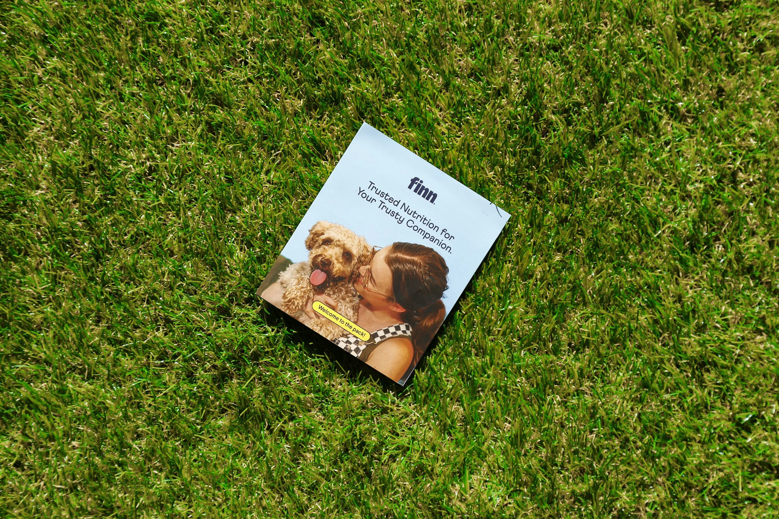
Trusted nutrition for your trusty companion.
Finn is a contemporary pet wellness company that provides dogs with everything they need to live happy and healthy lives. Its original focus was dog supplements, but since its launch, the brand has expanded into new categories such as dog skincare, haircare, and special drops.
I served as Finn’s founding Designer and Creative Director for four years, working closely with the team to evolve the brand from its four original SKUs into a fully developed brand with a unified visual and digital presence. As the sole brand designer on the team, I pivoted between packaging design, web design, photoshoots, creative direction for marketing campaigns, content design, UX improvements, email design, and print collateral.
Here are some of the projects we worked on.
-
Creative Direction
Marketing Collateral Design
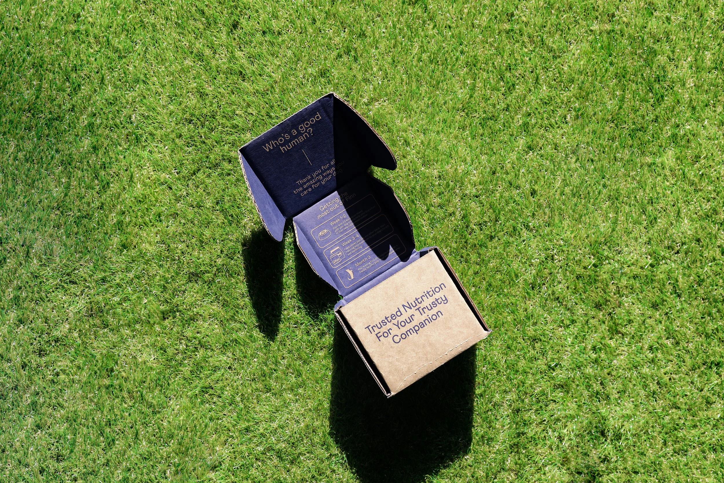
Packaging Design, Unboxing Experience
Web Design
Photography
Illustration
Content Creation
-
Branding Studio: Gander
Colin Derreta (Founder)
James Shalhoub (Founder)
Alex Song (Founder)
Nick Michlewicz (Founder)
Randall Stainton (President)
Laura Meschini (Marketing)
Kim Hengel (Supply Chain)
Taylor Rayne (Social Media)
Tamara Rahoumi (Founder Content Manager)
Addison Anthony (Founder Content Writer)
-
New York

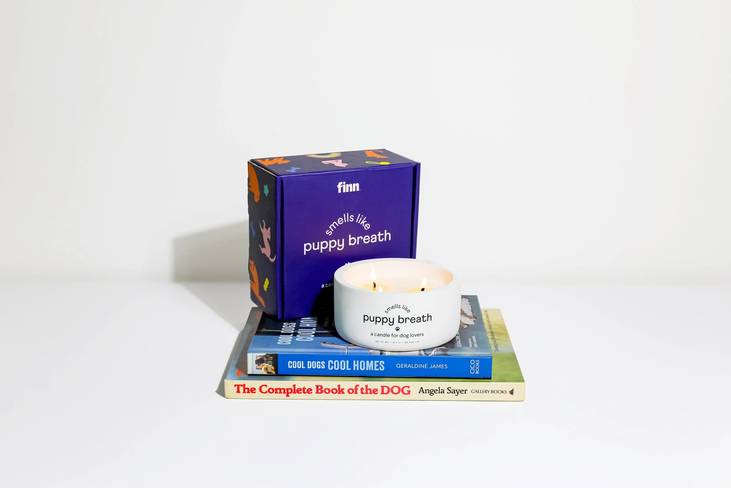
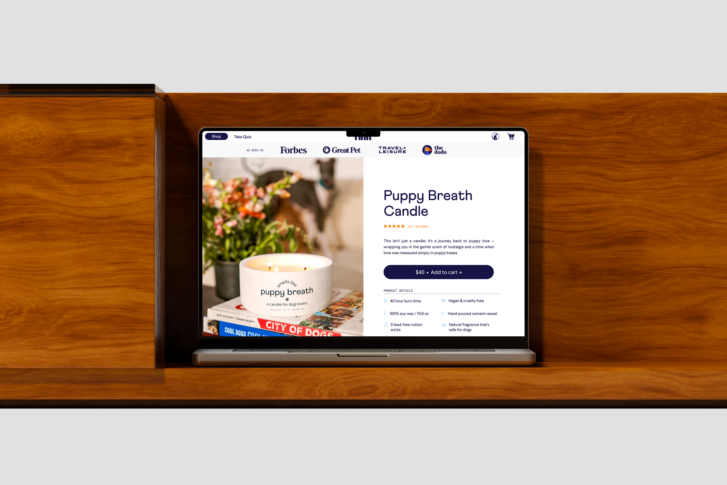
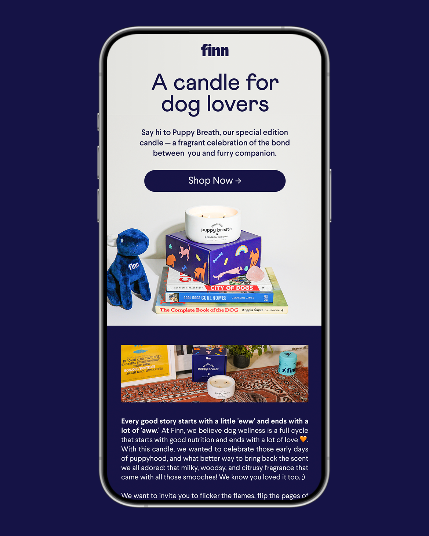
Puppy Breath Candle
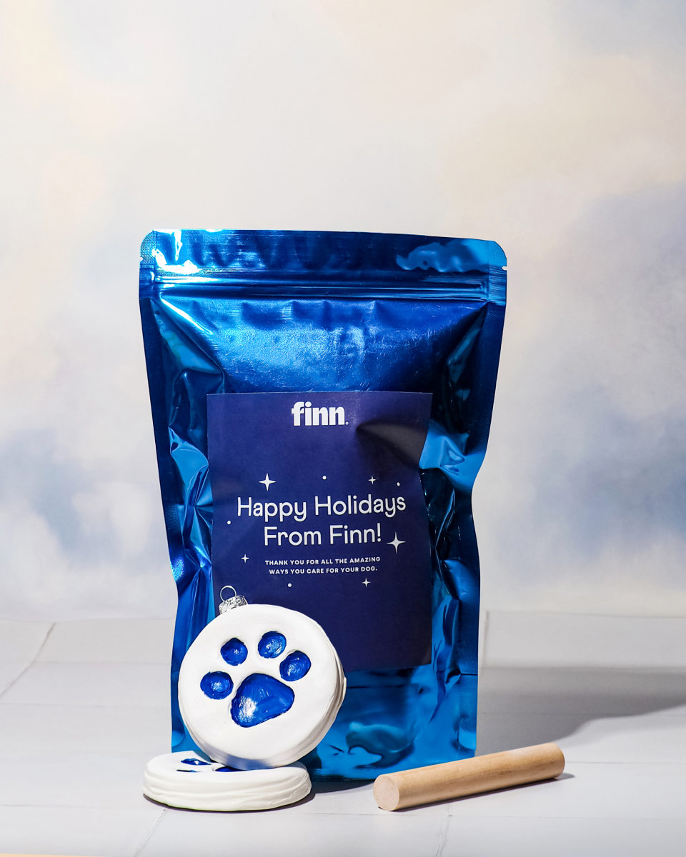
Finn releases a unique product to celebrate dog parents as part of their annual holiday tradition. The Puppy Breath candle is a special creation designed to capture the essence of early puppy parenthood and bring back fond memories of that particular time.
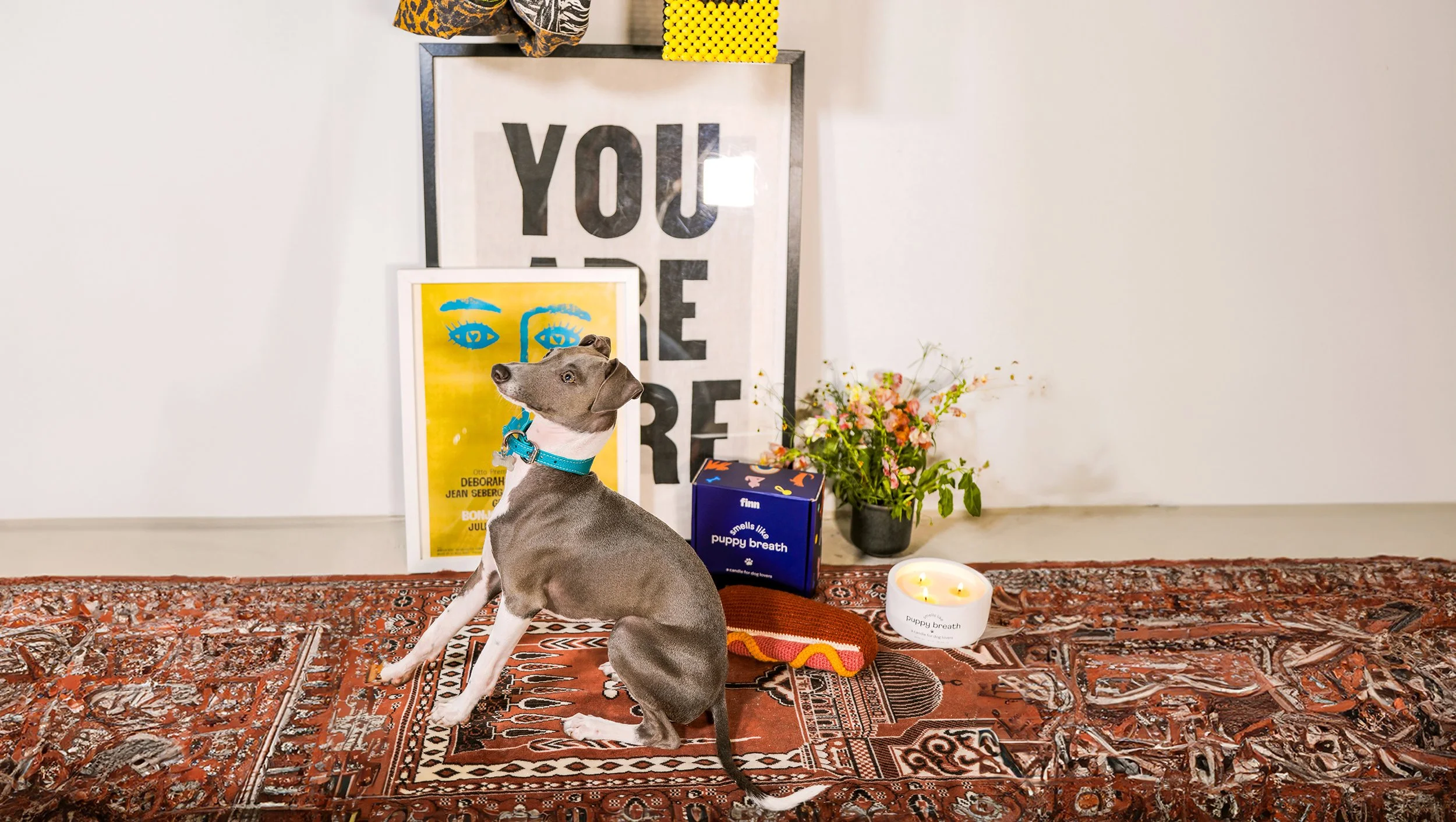
For Puppy Breath, we aimed to deviate slightly from the norm and inject some playfulness into the design. Who doesn't love a bit of puppy chaos, after all? We brought back Finn's illustrations and made them the centerpiece of the packaging, intentionally creating a chaotic look to celebrate the many different, colorful, and branded elements that Finn showcases across its portfolio.


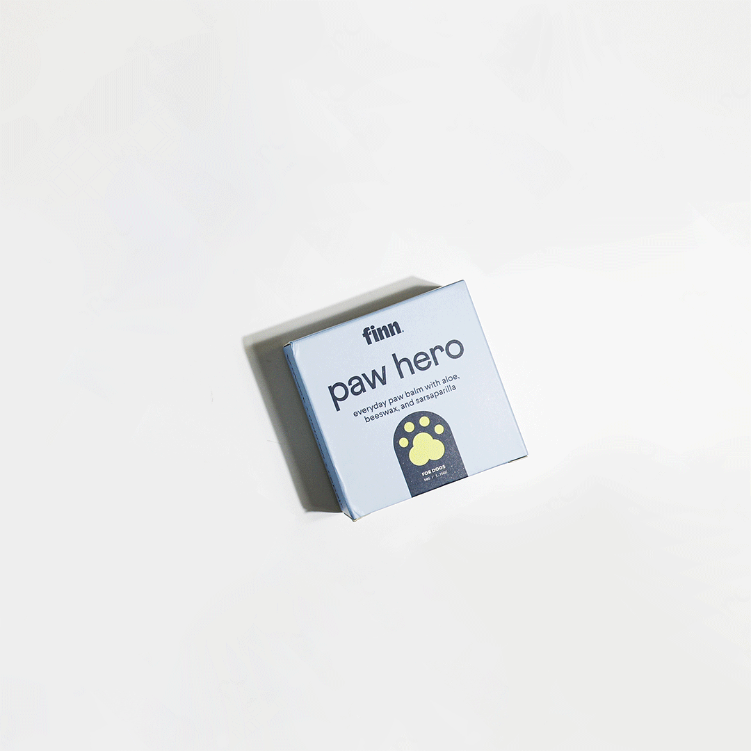
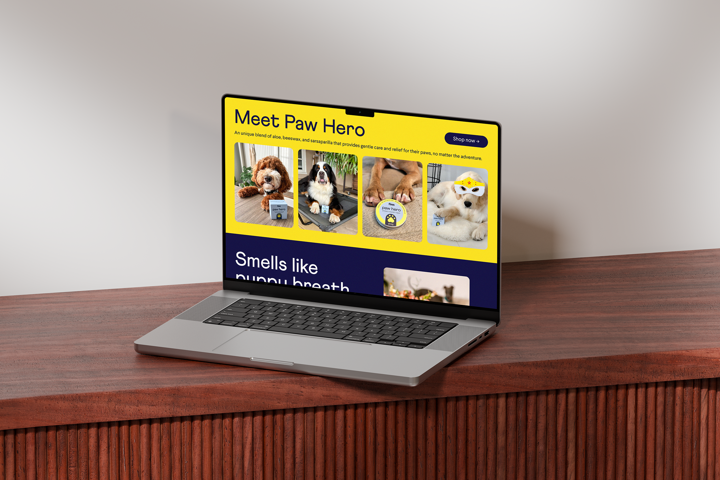
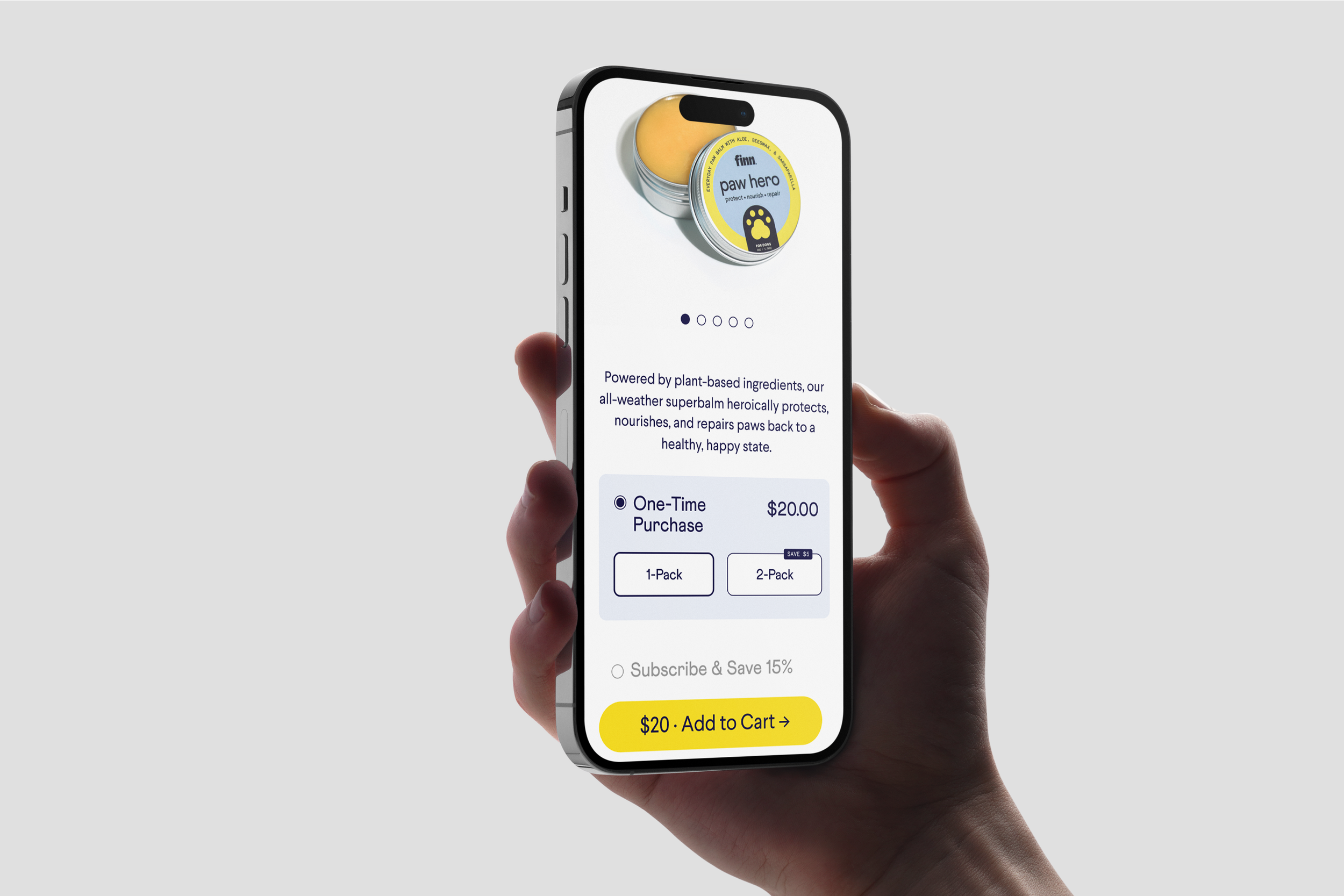
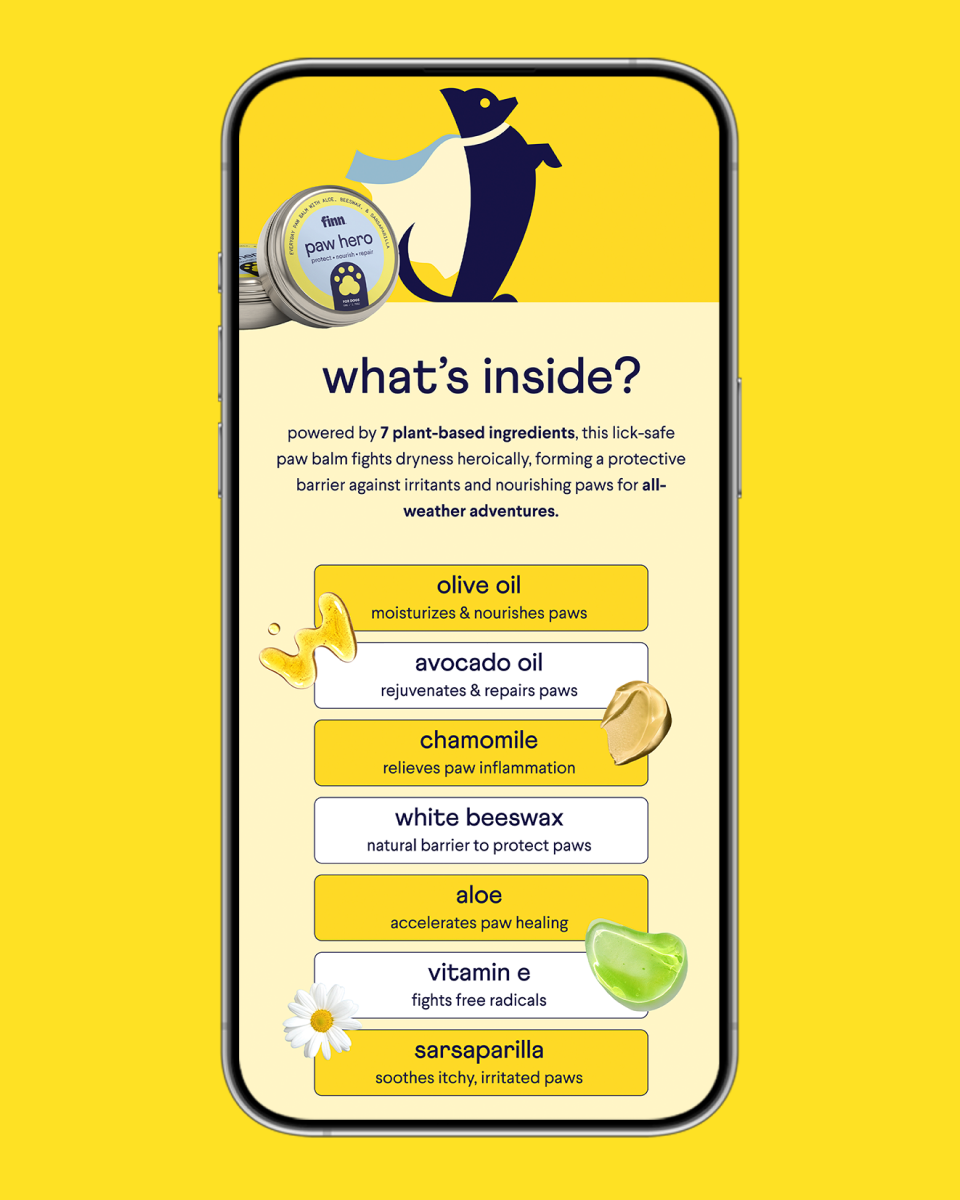
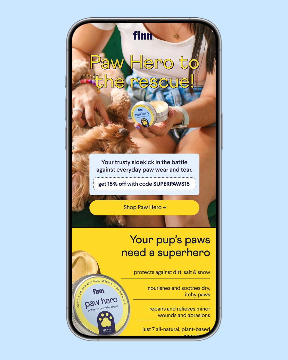
Paw Hero
Paw Hero is Finn’s first skincare product, which sets the beginning of an expanding line. We worked on a distinctive creative direction, opening the brand’s packaging design to more elements and typography play so it feels more relatable to its human counterpart.

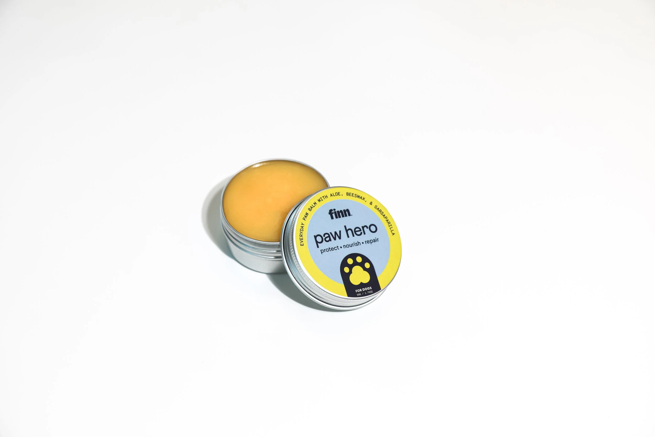
When Finn decided to expand their product portfolio beyond supplements, it faced the challenge of preserving the simplicity of the brand's design while creating a unique identity that could be carried over to their new line. To address this challenge, we capitalized on the available dead space on both the tin and the box to convey the necessary product information.

To give the packaging a touch of softness and calm that is characteristic of human skin care products, we opted for a color pairing of light blue and yellow, complementing their signature navy. This color combination not only added a subtle visual appeal to the packaging but also helped to distinguish the skincare line from its supplement catalog.
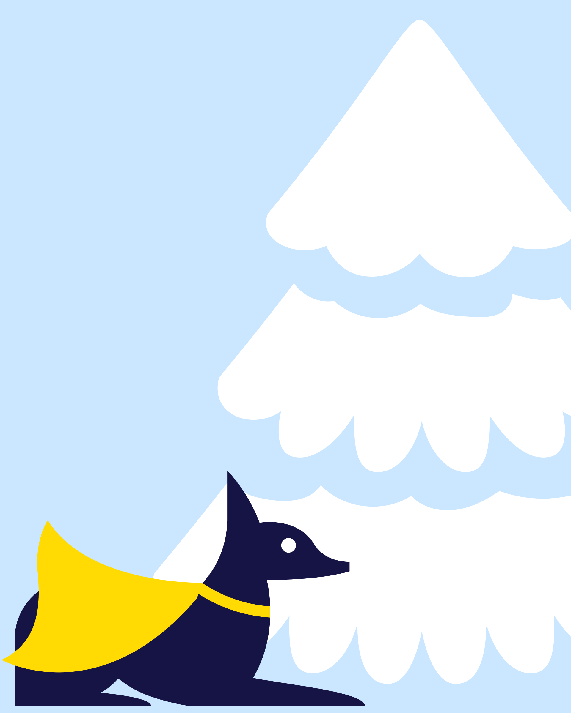
We came up with a unique concept of showcasing Finn's dogs as superheroes in a fictional city. We aimed to create a fun and engaging story that would resonate with our target audience.

From heat, dirt, and allergies to snow, ice, and salt.

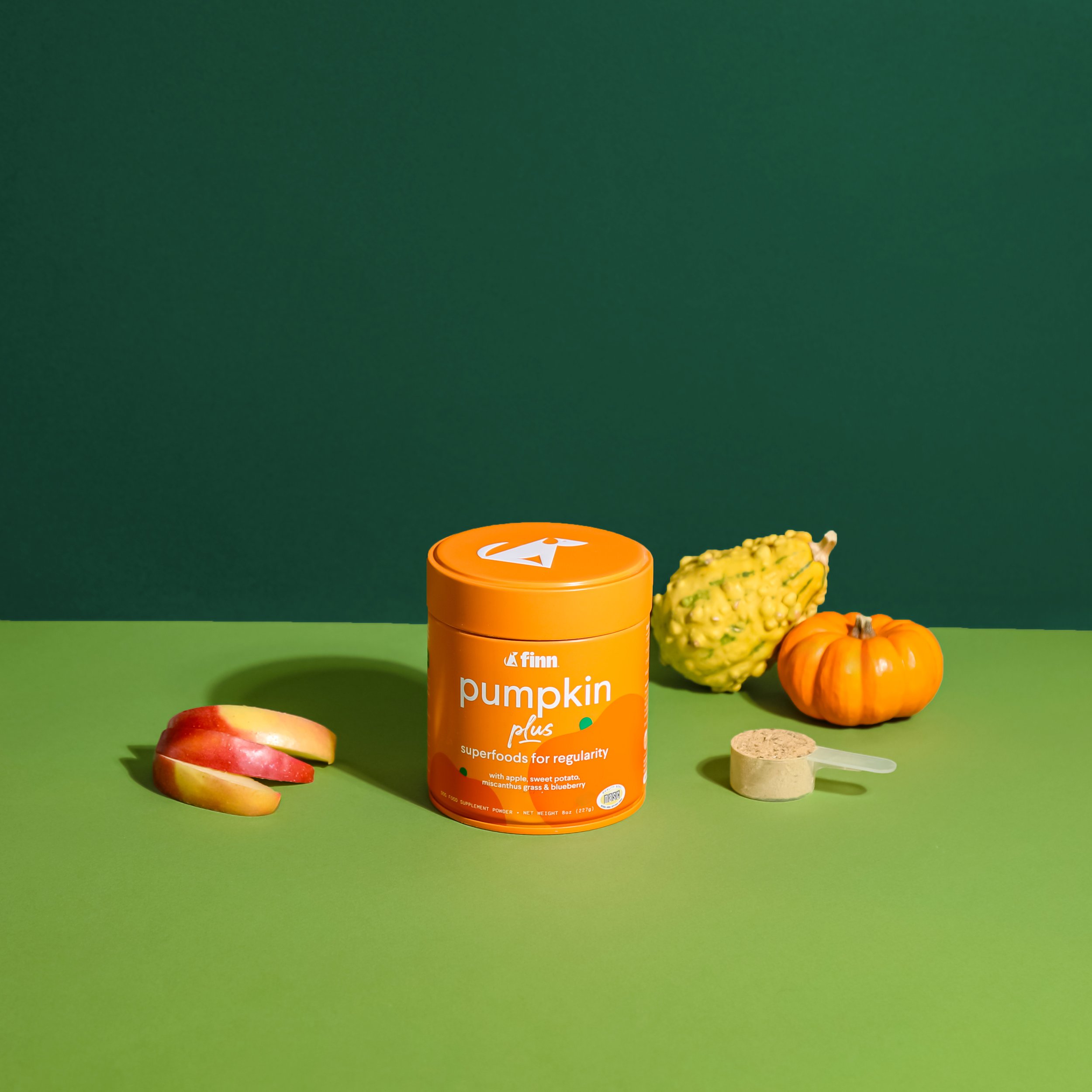
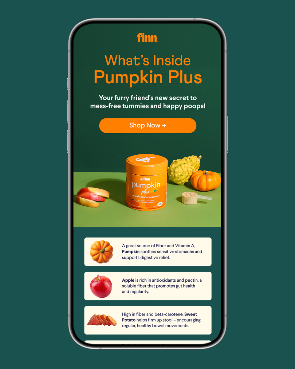
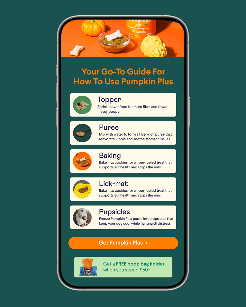
Pumpkin Plus
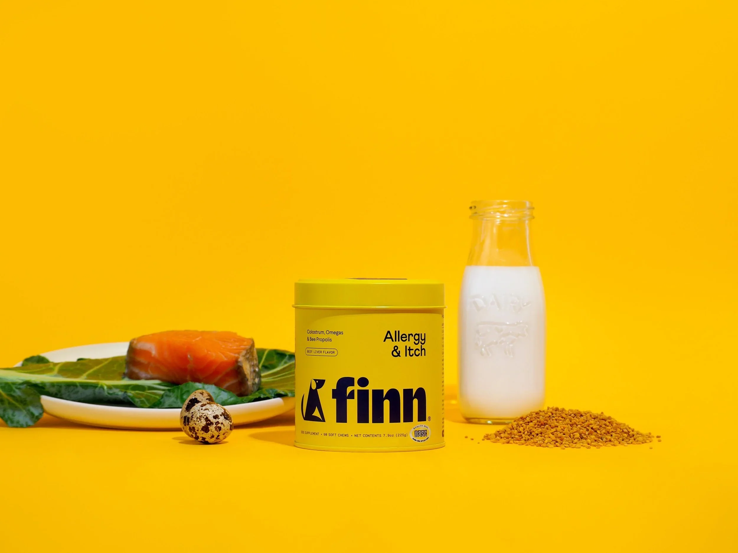
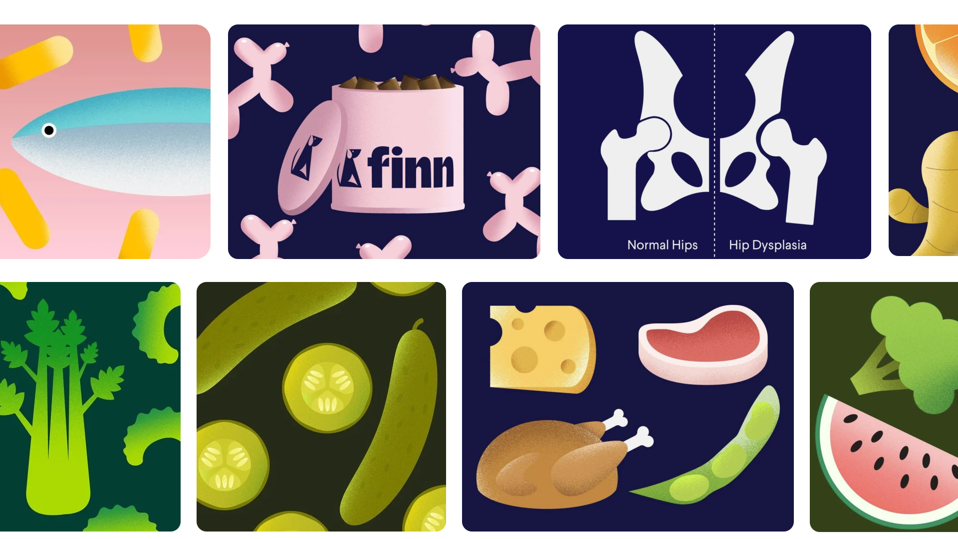
Pumpkin Plus is the first product of Finn’s new line of superfood powders, and with it, a new design direction for the supplements category was born.
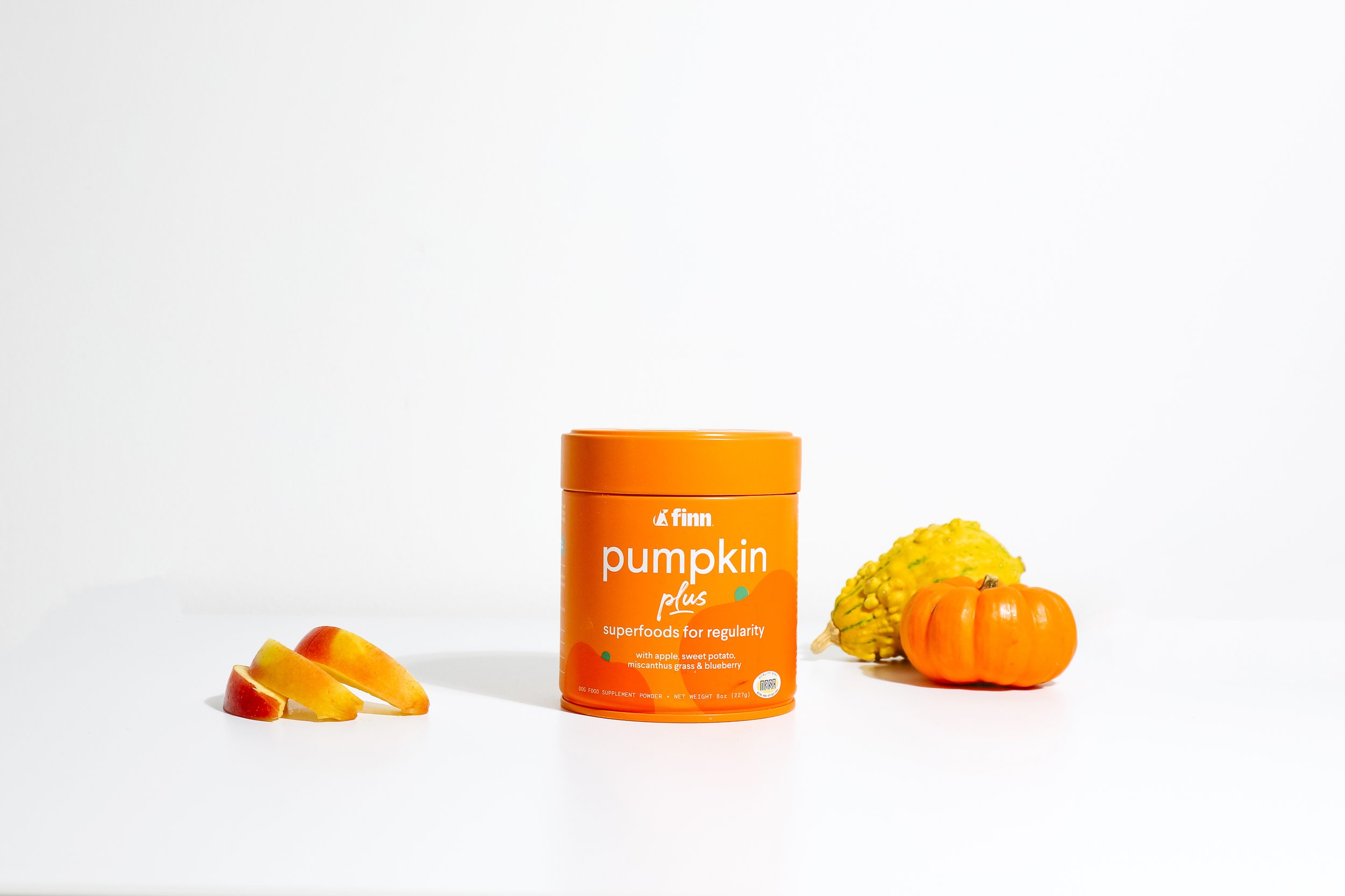
We added illustrations to our packaging for the first time. It was crucial to create illustrations that shared a good balance with the brand illustration system. Finn's superfoods powders are unique as they focus on the hero ingredient instead of product benefits, so the design needed to reflect this and display the ingredient prominently.
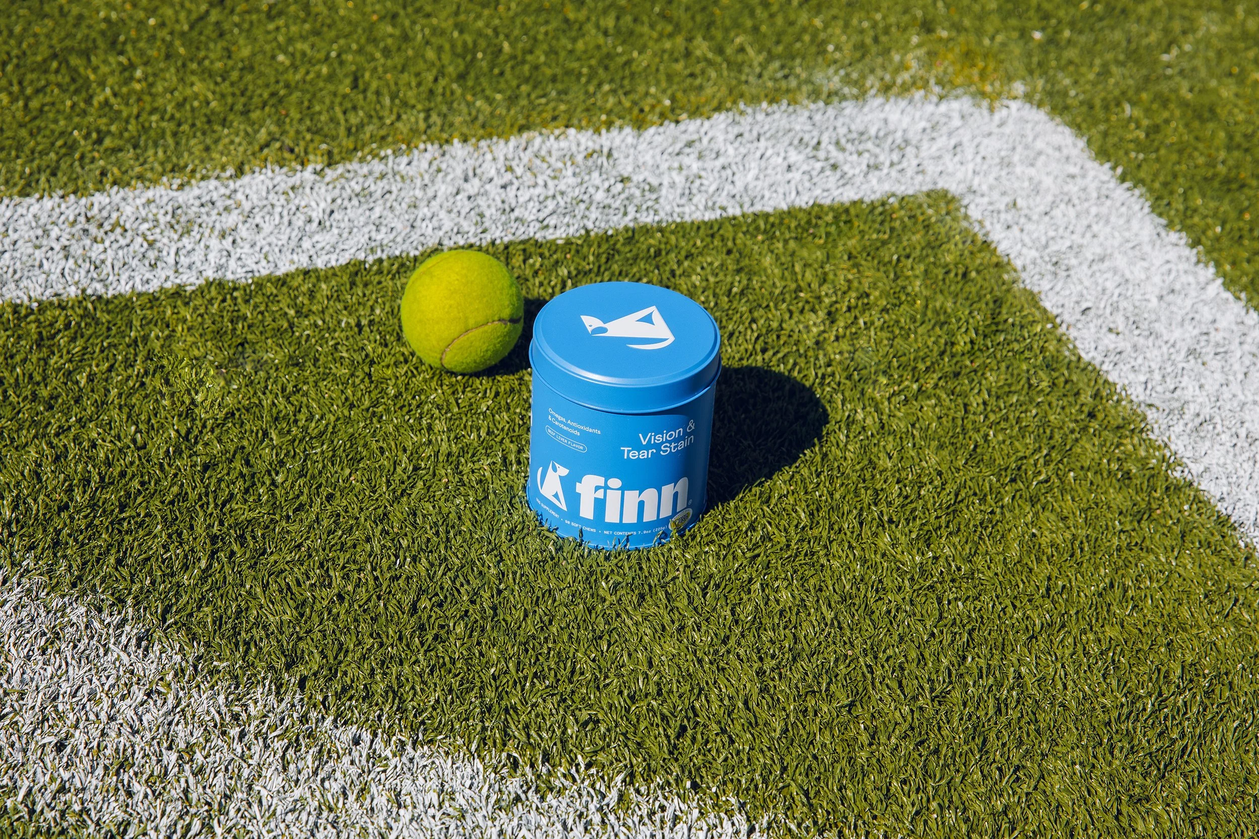
Product Expansion
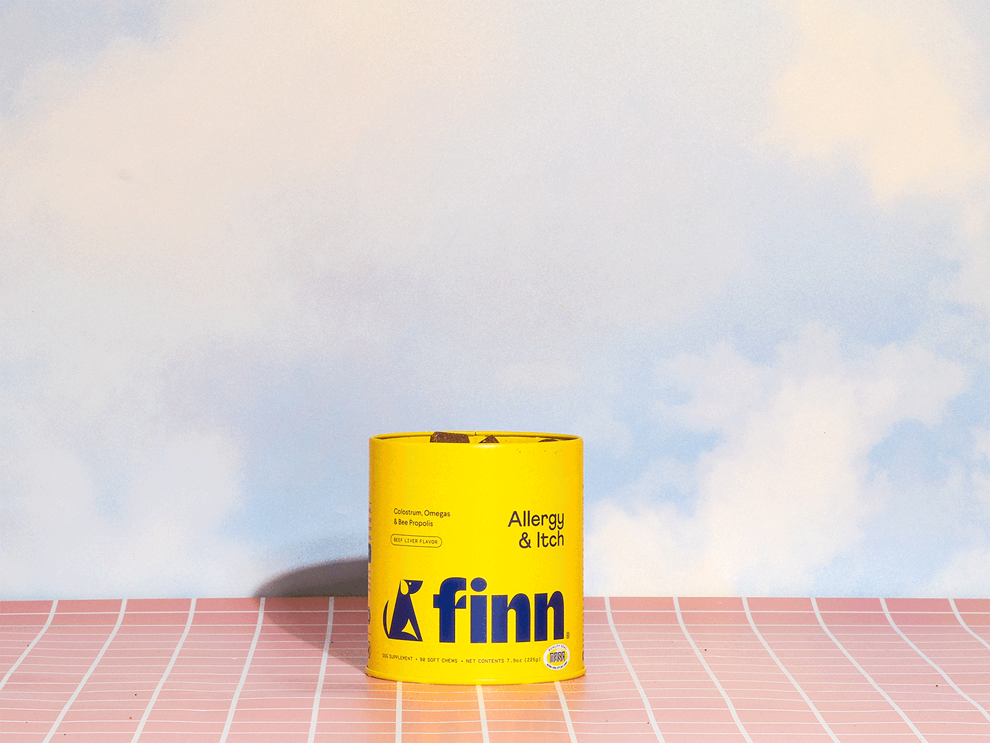
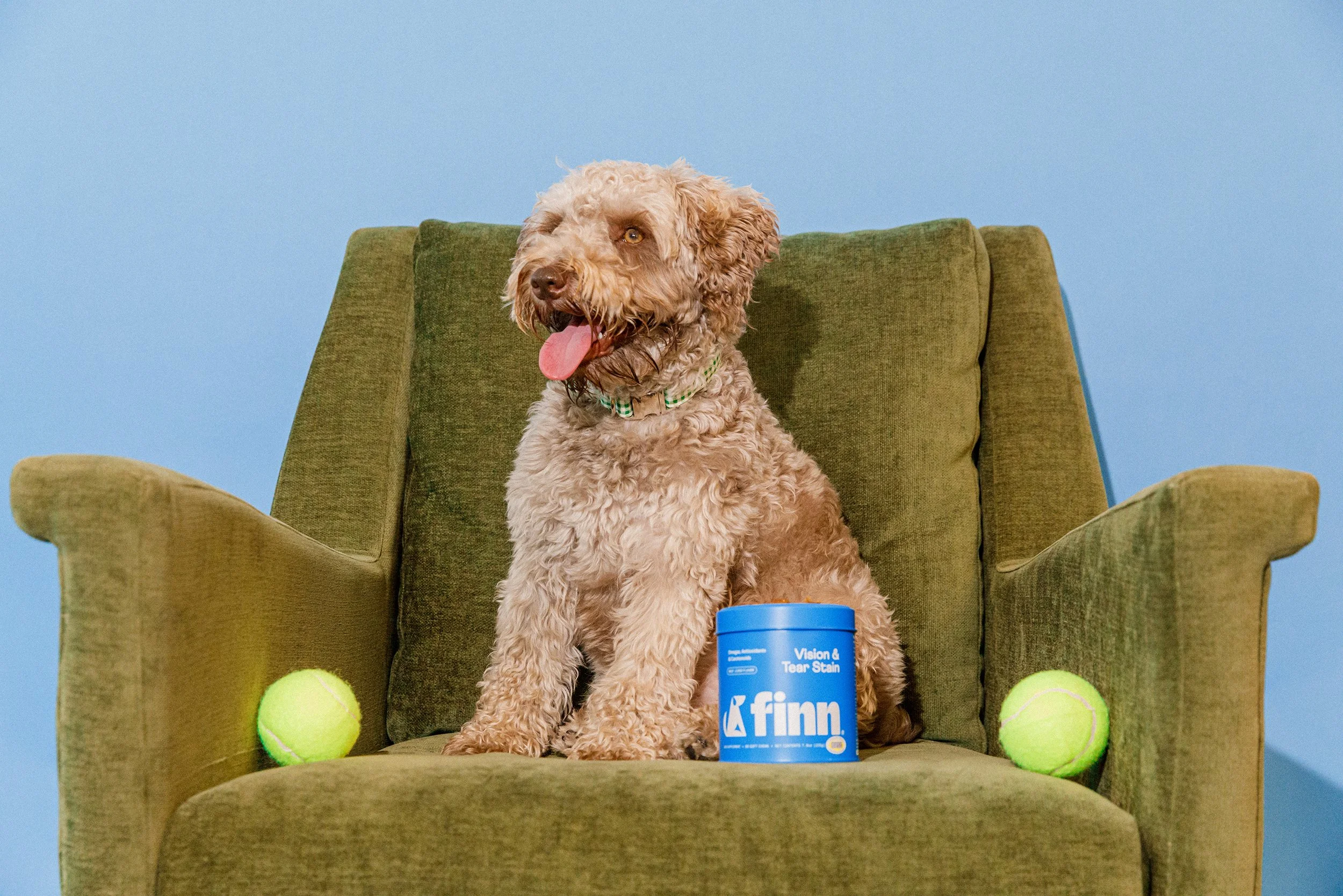
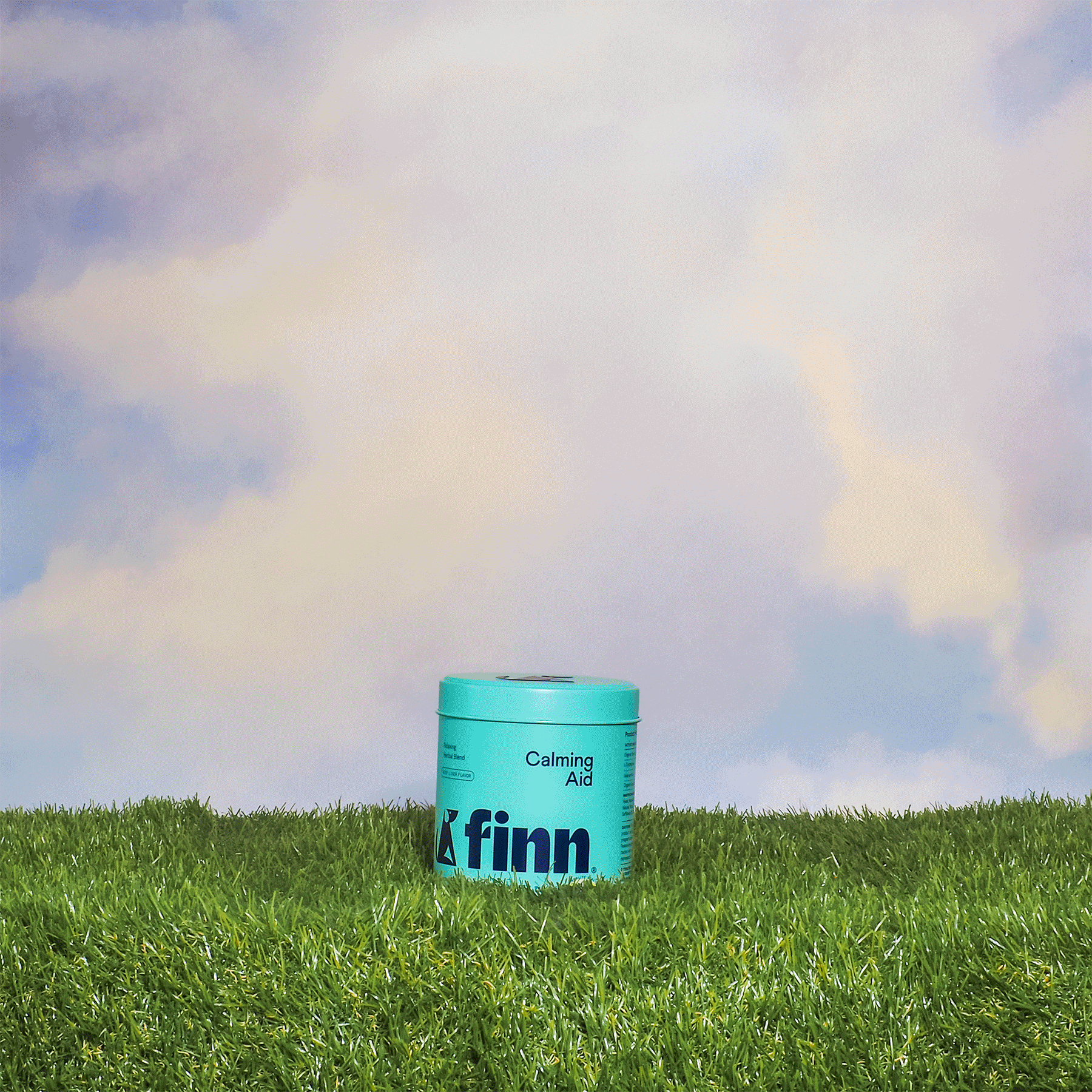
We launched 3 new SKUs part of the supplement line: Allergy & Itch, Digestive Probiotics, and Vision & Tear Stain. We maintained the packaging art direction by Gander and introduced a new color palette to the brand.
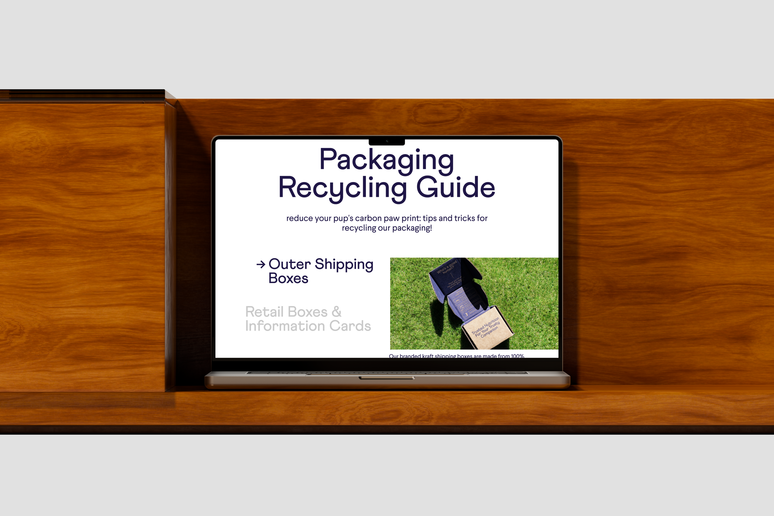
Packaging Experience
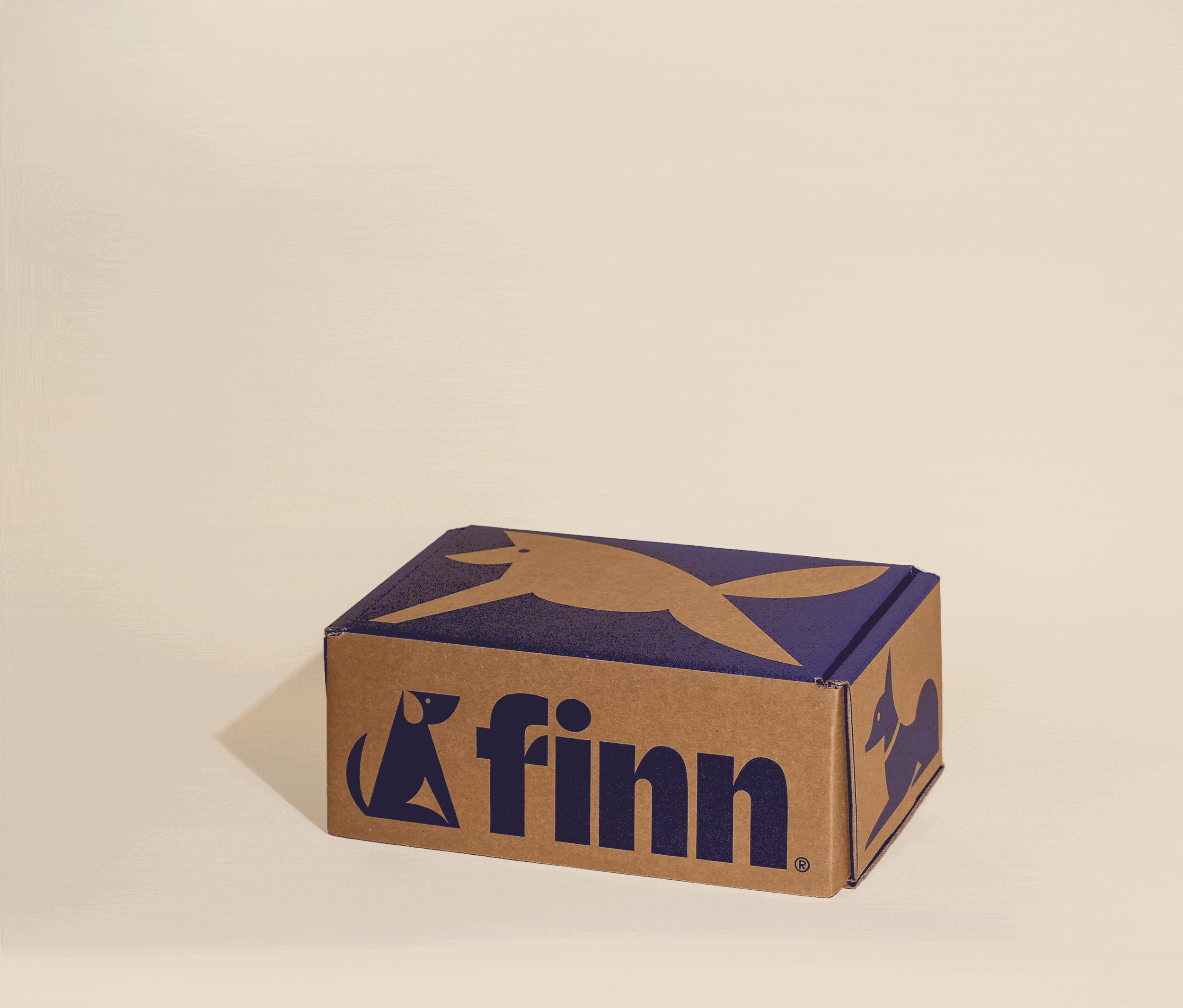
Finn’s packaging became the key canvas for building customer connection, and throughout its evolution, we increased the focus on the unboxing experience and the product’s longevity post-purchase.
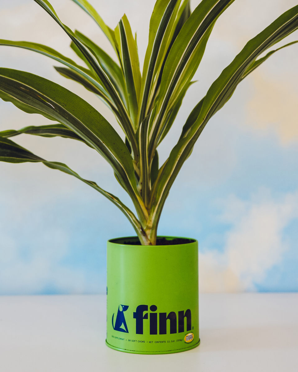
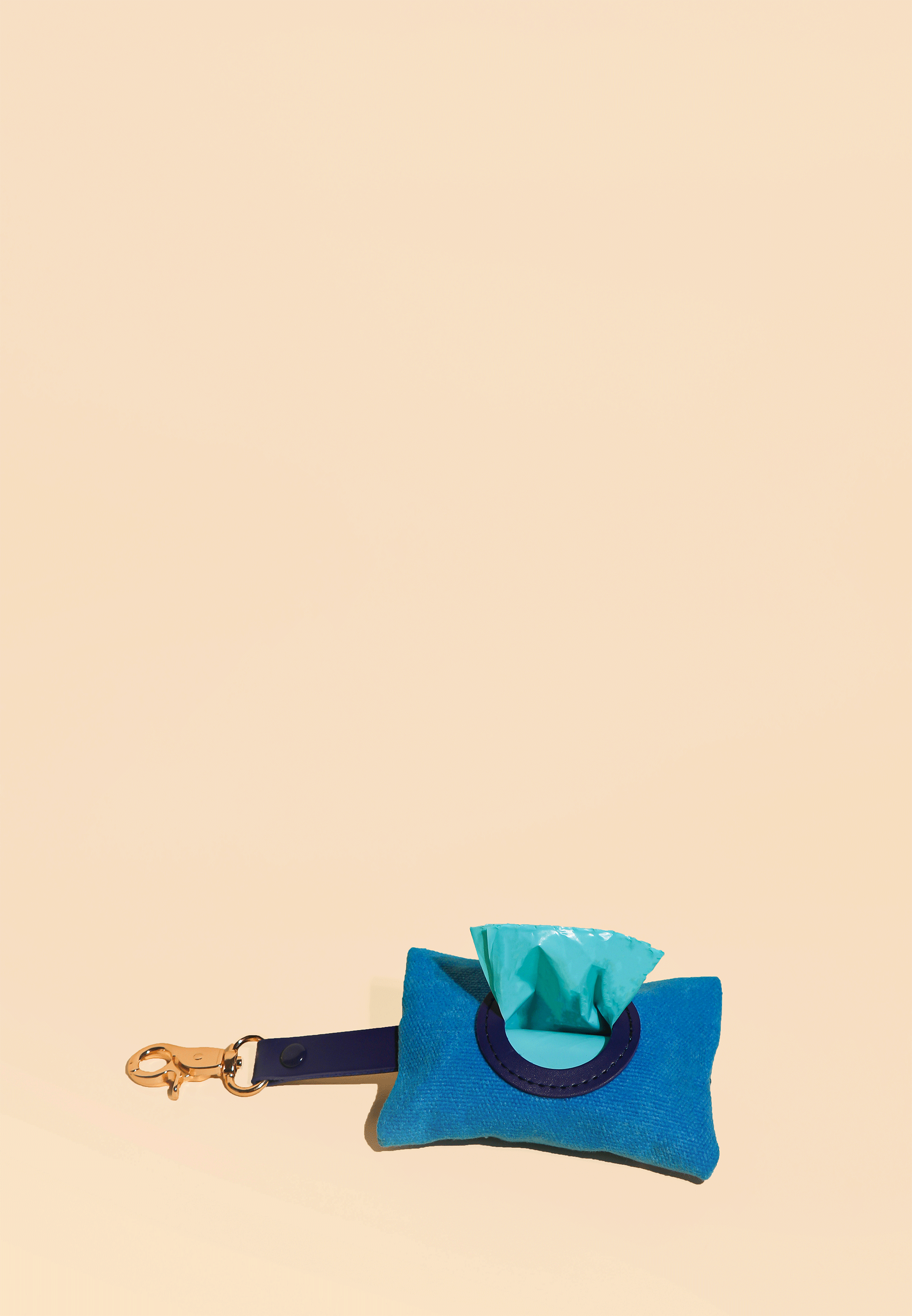
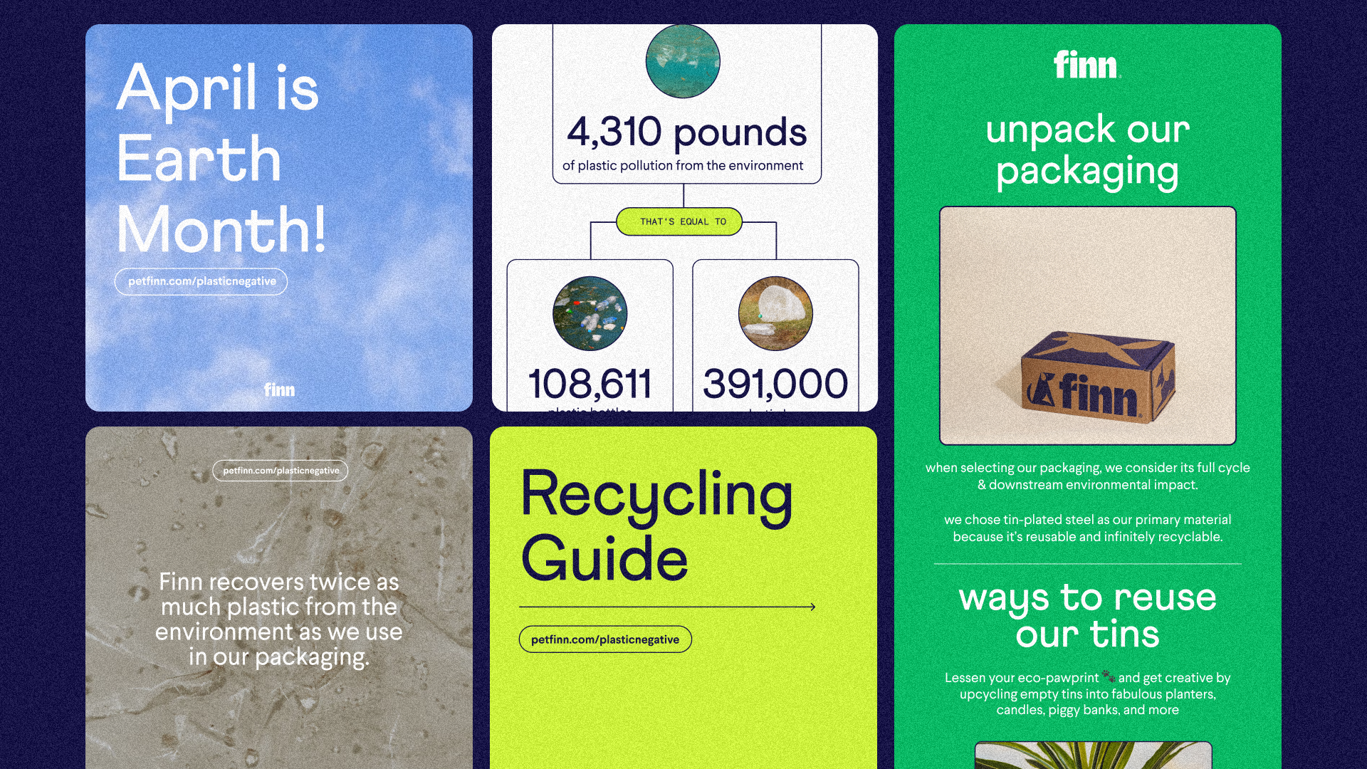
Becoming certified plastic neutral was a major milestone for the brand and an opportunity to drive awareness through various campaigns, from promoting product upcycling and recycling guides to launching occasional product drops like the waste bag and paw print kit. These initiatives aimed to preserve the brand’s approachable tone and create memorable moments for both humans and their dogs.
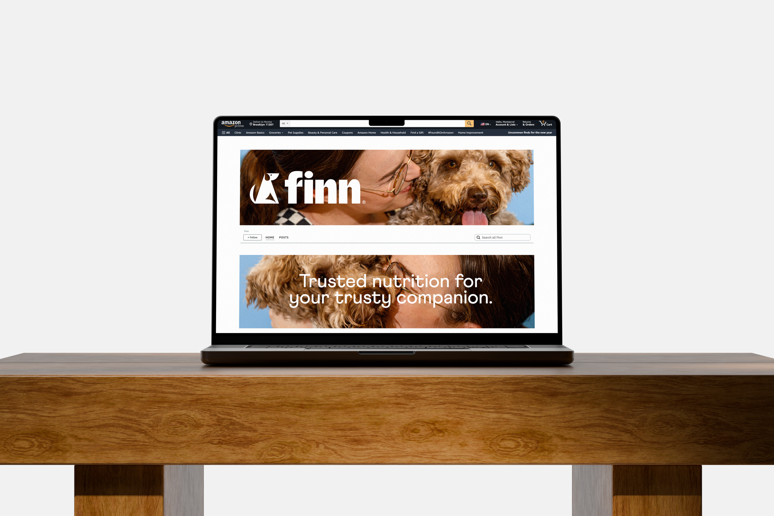
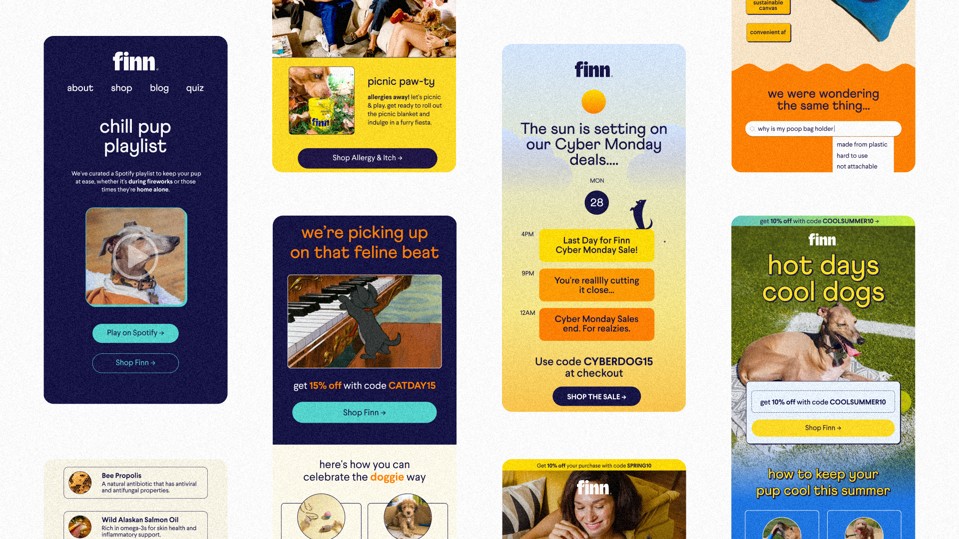
Web Design & Multi-Channel Optimization

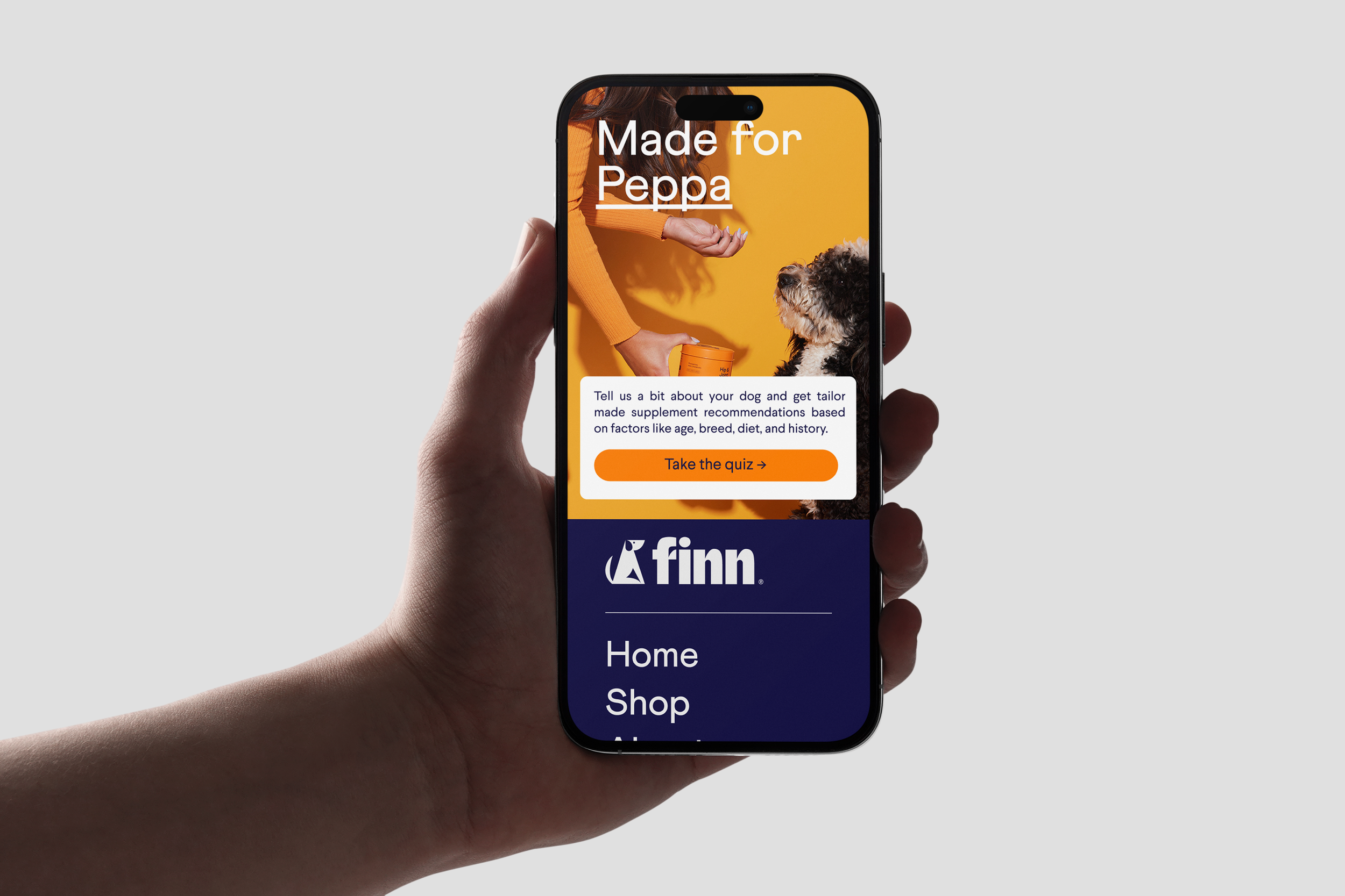


Content Design
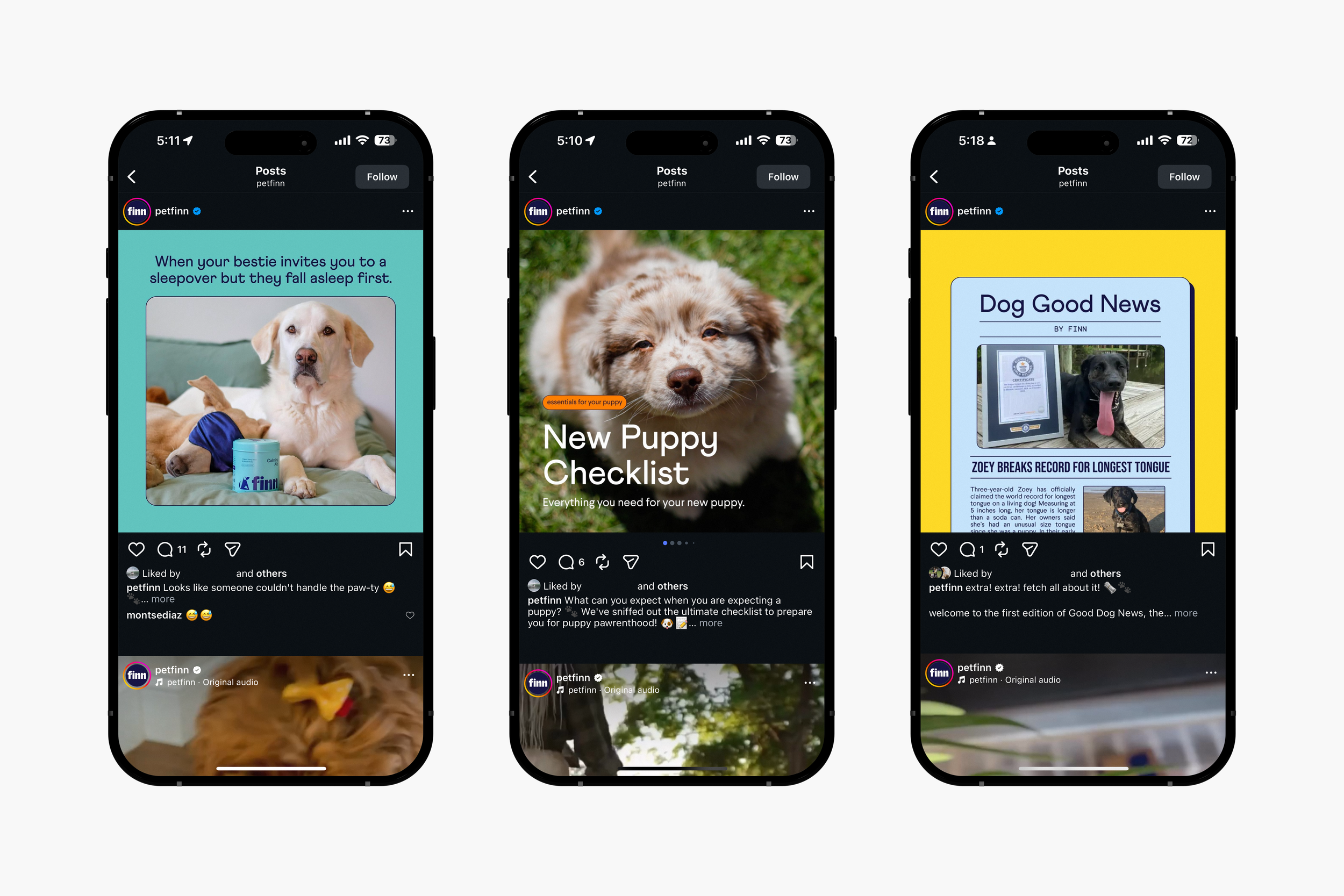
Finn emails have been featured on Really Good Emails and Email Love. We produced all animated and static content for Facebook, Instagram, TikTok, and the brand’s blog for organic reach and digital advertisements. More content samples can be shared upon request. ✦︎


Blog Assets
Explore my work as Finn’s photographer
© 2025 Montse Díaz — All Rights Reserved.
Please do not reproduce, screenshot, quote, or use this work without written permission.
For licensing, inquiries, or collaborations, please contact me. ✦